

When the first smartphone was launched in 2000, nobody at any point thought how the web page browsing experience will be in mobile phones and it took almost 10 years for the industry to realize that the user experience is critical for mobile web pages as well. Other than Apps, even Google didn’t expect the growth when it comes to the number of people using smartphones for browsing.

There is no uncertainty that business needs to target clients on smartphones yet the question is how? We should experience the adventure from where we began.
Native iOS and Android App
Before the Responsive Design came in to place and with the increase in the smartphone usage it was not a decent experience when searched or browsed using smartphones, so organizations started building iOS and Android App for their websites thinking that users will simply install the app and will lead to more engagement.
Native Apps provide the finest user experience but the biggest problem was that it required a download. People simply won’t download an App unless if the site has some useful information that user opens it every now and again.
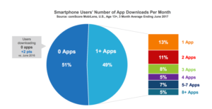
As per comScore, Majority of U.S. consumers still download zero apps per month. A recent study shows that an average user spends 80% of his total time on apps on only three of his apps, the other apps just sit idle for most of the time consuming a major portion of the memory.
Building an app costs around ten times than creating a website for the same. The cost can get much higher if you plan to develop for different platforms like Android, iOS and the web. The maintenance of an App is another expensive affair. Also, the time required to build an App was another concern.
Indeed, even after overcoming all the above factors, people ignored downloading an App and this lead to come up with another solution to the mobile web browsing experience – Responsive Web Design.
Responsive Web Design
Responsive Design will render the webpage in any device like desktop, tablets, smartphone etc without breaking the design. In short, it just resizes the image and layout depending upon the device the page is taken. In short, with Responsive Design, you will only have one site.
Good planning is required to make a site responsive because it needs to be planned in ahead of how the page elements will be resized or hidden when taken on different devices. For instance, it’s not a good practice to show a large image on smartphones so either the size ought to be lessened or the image ought to be removed for better user experience.
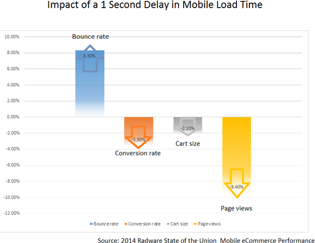
It was generally believed that Responsive Design was here to stay but the issue with the loading speed on mobile devices and with Google rolling out mobile-first indexing lead Google to research on finding a solution to fast loading mobile web pages.
We most likely might imagine that with the entry of Responsive Design, it’s going to stay at least for the next 5 years but now it’s time to get prepared for another turnaround. Accelerated Mobile Pages (AMP) and Progressive Web Apps (PWA) will be the future when it comes to browsing web pages in smartphones!
Accelerated Mobile Pages (AMP)
AMP is an open-source library that provides a straightforward way to create web pages that are compelling, smooth, and load near instantaneously for users. AMP pages are just web pages that you can link to and are controlled by you. AMP aims to bring back the beauty of the mobile web.
Here are the features or advantages of AMP:
- Faster Loading – AMP pages loads under one second and this will lead to more engagement with users.
- Increased Revenue – According to Google, for every extra second a web page takes to load, conversions fall by 12 percent.
- AMP offers a faster experience for all devices and platforms including Google, Bing, LinkedIn etc.
- AMP pages support design customization and flexibility.
- AMP builds on your existing skill sets and frameworks to create web pages. AMP is supported by many different platforms, and it’s compatible across browsers.
- Flexibility and Control – AMP allows to retain own branding and allows to customize CSS for better styling.
- Easy to Implement – Implementation is simple and straightforward. AMP plugins are available for popular CMS like WordPress and Drupal.
AMP is actually made of 3 core technical components AMP HTML, AMP JS, and AMP Cache. The combination of all the three makes it super fast AMP experience:
The AMP HTML is HTML with some restrictions for reliable performance. It is basically HTML extended with custom AMP properties.
The AMP JS library ensures the fast rendering of AMP HTML pages. This makes external resources load later so that nothing on the page can block from rendering.
The Google AMP Cache can be used to serve cached AMP HTML pages. The Google AMP Cache is a proxy-based content delivery network for delivering all valid AMP documents. It fetches AMP HTML pages, caches them, and improves page performance automatically.
When it comes to the benefits of implementing AMP, many publishers and websites around the world are seeing solid business results with AMP. From increased engagement and retention to audience growth and monetization.
Let’s get started by creating your first AMP page!
Progressive Web Apps (PWA)
PWA are web pages when browsed on smartphones give an immersive, fast, reliable, engaging and native app like experience to users.
These web applications use caching, background sync, and push notifications.

The features or advantages include:
- Ability to access the web pages and content while offline, this is possible because of the caching of URLs.
- Caching enables pages to load faster than ever before.
- Ability to pin the site on your iOS, Android or Windows smartphone home page.
- An App like feeling without no address bar or browser tools.
- Pre-filled forms – No more wasting of time to fill up the forms.
- Quick Payments with auto-filled fields, only need to enter the CVV.
- Enable to send push notifications to users.
- Less expensive to create, update and maintain PWA’s when compared to building Apps.
The only disadvantage is Slower first delivery. We will discuss later on how to tackle this.
Web App Manifest and Service Workers are the two major components of a PWA.
The web app manifest is a simple JSON file that tells the browser about your web application and how it should behave when ‘installed’ on the user’s mobile device or desktop. Having a manifest is required by Chrome to show the Add to Home Screen prompt.
A service worker is a script that your browser runs in the background, separate from a web page, opening the door to features that don’t need a web page or user interaction. Rich offline experiences, periodic background syncs, push notifications—functionality that would normally require a native application—are coming to the web. Service workers provide the technical foundation that all these features rely on.
Alibaba, Flipkart, Forbes, Twitter etc are some of the top companies that implemented the PWA. Browse and feel the rich experience!
Learn about the difference between AMP and PWA,
Progressive Web Accelerated Mobile Pages (PWAMP)
AMP loads in a blazing speed but cannot give a good user experience like Apps, on the other hand, PWA’s gives a rich user experience but slower first delivery. To tackle this problem Google’s AMP Conf 2018 guided audience on merging both AMP and PWA and named it as PWAMP, the short form of Progressive Web Accelerated Mobile Pages.
Combining both will bring all the advantages and provides a seamless web experience. Now let’s see how the customer journey looks like on a PWAMP.
- Search – The visitor types a keyword on search engines like Google or Bing and the user encounters AMP pages, which loads in a lightning speed.
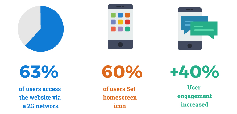
- Installs PWA – As the user reads or scroll through the page, the Service Worker installs PWA in the background. From here when clicked on any other site link, the user enters into PWA.
- Faster Page Loads – As the PWA caches all the pages, the pages are loaded instantly and will be able to navigate the entire site offline.
- Add to Home Screen – PWA can prompt users to pin the App icon to the home screen. PWA will give the same experience as native apps and this will add more engagement with the users.
Here is the video tutorial on combining AMP with PWA.
PWAMP is evolving quite fast and we can hope to see these features come to action pretty soon!
So why wait, give your users a seamless rich experience before this new year!
seo_stuff
Nice Blog, Thank You