

What is a landing page?
A landing page is a web page created with specific marketing goals. A landing page can be created even to educate or warm up potential customers before sending them to your sales funnel.
Landing pages inspire visitors to:
- Buy product or service.
- Subscribe to email lists or newsletter.
- Download ebooks or videos.
- Signup for a free, paid or demo account.
- Create social media connections.
- Access to webinars, live podcasts or tutorials etc.
What are the characteristics of a landing page?
A Landing page is usually a standalone web page, means there is no link from anywhere on the website to access the landing page.
A landing page can be even hosted outside your own domain.
Landing pages are created with a single objective – known as a Call to Action (CTA) and this should be tied to your goal, so from the header to the footer section, the design and content of a landing page are limited to that goal. This will help visitors not to get distracted from the purpose of his visit.
Landing pages should be simple and shouldn’t contain too much information. It’s not a place to show creativity unless it is clear and persuasive.
How do people visit a landing page?
As there is no link provided in the website for a landing page, here are some of the main channels through which a visitor lands on a landing page:
- Ad campaigns such as Google AdWords, Bing Ads, AdRoll etc.
- Social Ad campaigns such as Facebook Ads, Twitter Ads, Instagram Ads etc.
- Email marketing campaigns etc
How to plan for a great landing page that converts?
You should have a definite goal before creating a landing page. You should have something to offer before setting a goal.
A goal can be:
- To increase the sales of a product or service by providing “Buy Now” button.
- Get email address of visitors for the purpose of sending them regular newsletters.
- Educate prospects via Ebooks downloads before sending them to sales funnel.
- Increase the youtube video views and comments.
- Increase the Facebook page likes etc.
- Any other goal that fits your purpose.
Who is my audience?
You should be clear on who the audience is before starting a campaign for the landing page. For example, if you run an ad campaign for selling expensive motorbike targeted to the age group above 60, then it won’t yield good results.
The text or keywords you provide in the ad campaign or email campaign should match with the offer on the page then only the user will find it beneficial. This will help to get increased conversion.
Who am I competing with?
Identify your close competitors and follow their best practices for your success. See how they have crafter their ads and designed their landing pages. It’s not advised to follow competitors blindly but always be open to accepting what you think is the best!
Elements of a great landing page
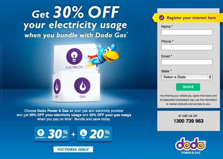
Focussed on the offer – A landing page should be completely focussed on the offer. No other text or design elements should distract the user.
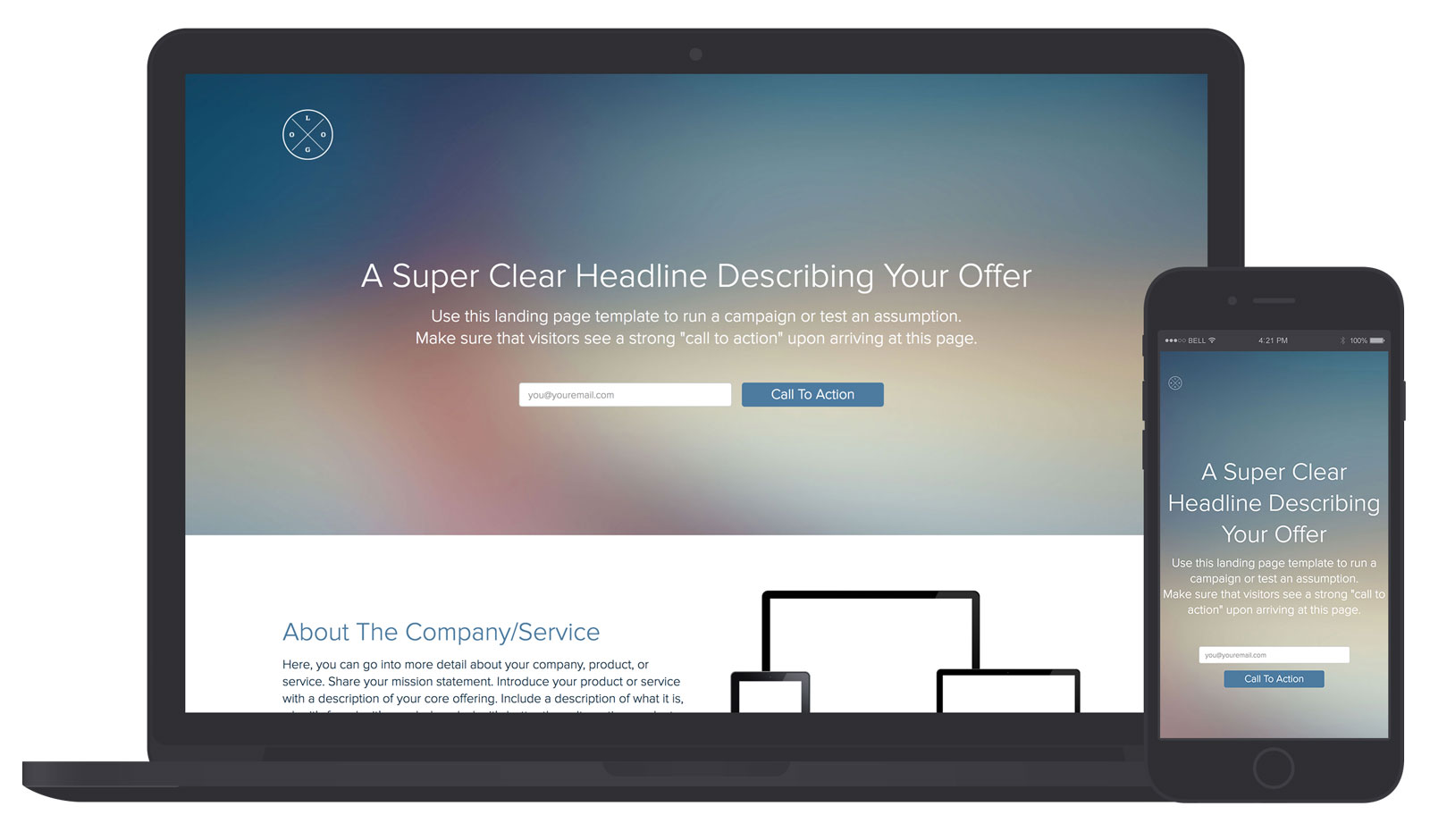
Attractive and uncluttered design – Landing pages should avoid too many contents and the page should be attractive enough by providing images and video. Show only the design elements which are essential to the objective and there should be enough blank space.
For a landing page, the design and layout can be entirely different from the website as it caters only for a specific purpose. The design should be responsive so that it renders across all devices.
Here are the Best Landing Page Design Examples You Need to See in 2018.
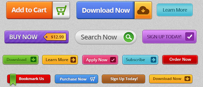
Clear call-to-action – Call to action button should be clear and strong so that the user will click on it. Call to action button text should be chosen carefully. Here are 50 call-to-action button phrases.
Keep your CTA above the fold – Your CTA should be visible when landed on the page without scrolling. Placing the CTA above the fold works wonders for your campaigns and is always good for conversions.
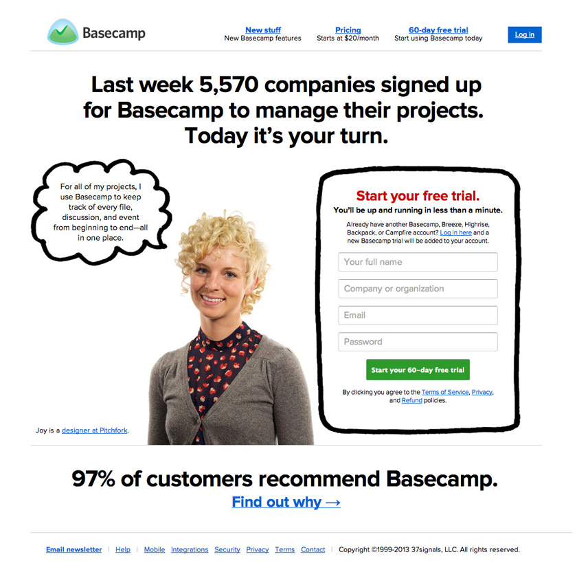
Remove navigation elements – To not to get distracted, it’s recommended to remove all navigation links and have only one call to action button. This will help to limit exit points.
Make it easy to convert – Once clicked on CTA, make the further steps simple and don’t complicate if it requires user input. Ask only required questions like email and phone number, other fields can be filled later once signed in. Consider using Facebook or Gmail for signing up quickly. For shopping cart sites it’s best to place a one-click checkout. Each extended step towards final action will likely result in losing conversions.
Eye-catching headlines – Provide a headline that will create interest, attention and give a clear message of what the product/service is all about. Avoid long headlines and limit it to 10 words. Here are the 5 Landing Page Headline Formulas You Can Test Today.
Subheadline – Subheadline is positioned beneath the heading. Provide a clear and attractive subheadline so that the visitor will proceed to click on the CTA. It is through this subheadline that a visitor will come to know more about the offer – product or service.

Understand the visitor – As mentioned above it’s important to identify who the user is or else the bounce rate will be very high.
Engaging media – Most online users don’t like to read much but love to engage through Images and videos. An image or video speaks a thousand words and it has more appealing power than tons of text! The media used should be relevant and should help to convert. Images and videos can be used to showcase products or services, promotions/offers, highlight customers, your brand story etc.
Researchers show that videos on landing pages are more effective than images.
Page speed – Page load speed is critical for a landing page, every second delay in loading the page will lead to an increase in bounce rate. Now as most of the searches come from smartphones, implementing PWAMP helps to load your page within one second.
Show reviews and testimonials – Reviews and testimonials increase confidence level among users and this helps to quicken the conversion. The best example is the reviews we see on Amazon, where we can see the number of people reviewed, their star ratings and their comments.
Trust indicators – Show the awards and honors your company has won and this will help to add credibility among potential customers. You can also provide the logos of top companies you have worked with.
Social proof – Use social signals such as Facebook likes and shares, twitter followers and tweets, Instagram posts etc will help convince visitors that other people have subscribed to our products and services.
A/B test – A/B testing is comparing two versions of a web page to see which one is performing better. Any element in your web page can be A/B tested like headlines, content, call-to-action buttons, images, links, forms etc. Placing the better performing page will yield more conversions. Here is an article from Neil Patel on 19 Obvious A/B Tests You Should Run on Your Website.
Thank you message – Once the action is completed always give confirmation by showing a thank you message and this will give the user a reassurance that the transaction was completed successfully. A confirmation mail should be sent to the user’s email address for keeping the records.
Also, place a social share button on the thank you page. The best salespeople are your customers!
Top Landing page builders
Online landing page builders allow to create and host the landing pages quickly. Most online landing page builders provide many templates and an editor to customize the design easily without the help of a developer. Here are the top landing page builders:
Please leave your comments below and let me know if I have missed anything!